Fantastic Four Issue 605

Fantastic Four Issue 605

With “Forever” taken care of, and Jonathan Hickman’s amazing run on Fantastic Four coming to an end soon, you might wonder what the writer has in store for his last few issues. As Vince and I said during a recent podcast episode, how can you top “Forever“? While I was not expecting him to coast till his next project, I certain was not expecting a story as poignant as “End of Line” featuring the Thing. Now, I won’t lie; I’ve never been a big fan of the Thing. Sure, he’s had some very strong character moments, such as with Johnny’s (supposed) death, however his two dimensionality has always held him back, in my opinion. The Thing likes to hit things. And that’s been his primary role in the Fantastic Four. What Hickman has done with “End of Line” is demonstrate that a powerful writer is capable of making us care about characters we otherwise wouldn’t. The story starts with a brief explanation of recent events, though the most important part pertains to the Thing. “Thanks to a serum devised by the kids of the Future Foundation, the Thing reverts to his normal human form for approximately one week every year.” Now, what we aren’t told, until later, is that it is only during these weeks that the Thing actually ages. During the course of this exceptional issue, we see Reed and his father Nathaniel travelling through time into the future at various intervals, to check up on the Thing. Their first stop is in NYC, 3012 A.D., where Reed’s suspicions are confirmed about the Thing’s ageing process. Next stop, NYC Territory, 4012 A.D., where we find the Thing giving a speech to the (very large) graduating class of the Future Foundation. Ben’s looking a little gruffier, rocking a stone beard for effect. He’s still uncomfortable with public speaking, though his few words are sincere and speak volumes of the many years he’s lived. Not happy to leave it at that, Reed asks his father to take them to 5012 A.D. and finally 6012 A.D., when an aged Thing has finally passed. Having seen during these times that the Thing has never forgotten what was most import in his life, his time with the Fantastic Four –which by all accounts would only represent a very small portion of his life– Reed makes the time for his best friend, leaving his lab to watch a fight on TV over a couple beers. This issue works on so many levels. You can’t simply break it down to a single line or two. To do so would be such a disservice to the work that went into crafting this amazing, touching, thought-provoking journey. Hickman proves yet again that he is as capable of producing inter-galactic wars, the likes of which we’ve rarely seen, as well as character-driven single issues which strike at your being like an uppercut from the Thing. Also, Garney and Keith did a phenomenal job with the art in this issue, capturing the time travel with style, and the facial expressions with all of the raw feeling that you would expect from such a story. Regardless of what you have thought of Fantastic Four in the past, you owe it to yourself to pick up this issue. Fantastic Four Issue 605 Marvel Story: Jonathan Hickman Art: Ron Garney, Jason Keith...

The Amazing Spider-Man Issue 682

The Amazing Spider-Man Issue 682

Spider-Man has been ridding one hell of a wave as of late. Between his team-ups with the Avengers, FF, and various duo story-arcs, he’s proven that he can hold his own amongst (and against) the best. While that may not be anything new, what is new is that his personal life is finally looking up as well. Sure, he and Carly decided to call it quits, but MJ’s already back in the picture, and no doubt will lead to more than just hot coffee (if you know what I mean, he writes with a wink). At the start of The Amazing Spider-Man issue 682, we see Spider-Man taking on Equinox using gadgets he’s developed at Horizon Labs. I loved the Goblin throwback, and Stefano Caselli’s artwork for this was nothing short of insane (which we’ll get more into in a bit). The scene, as well as the one immediately following the fight, is important because it allows Peter to come to the realization that it isn’t just Spider-Man who is saving lives and bettering mankind; a man’s legs are saved thanks to one of Peter’s inventions from Horizon Labs. A look around the city during a walk in to work allows Parker to see how much of an influence his inventions have had on others around him; inventions which first had been made to help Spider-Man. Of course, any longtime reader of the series knows; Peter cannot remain happy or at peace long. Let’s be honest, the universe would collapse. Queue Doctor Octopus and his nefarious plan which started several issues back. But wait… is it nefarious? Doc Oc turns up the heat on the planet, using satellites he’s gotten into space (see prior ASM issues co-starring Johnny Storm). In a worldwide television broadcast, he claims to have a solution to global warming, and that as one of his last acts, the doc wants to leave the world in a better state than when he came in. You see, the ol’ boy’s dying. Truth be told, he is not looking his best, which brings me back to Caselli’s artwork in this issue. Caselli is the man. Seriously. This issue is a testament to what amazing art can be in comics. Check out these two page spreads and tell me you aren’t seriously impressed. Caselli and Frank Martin Jr. go above and beyond with these. Which leads us to Dan Slott. Slott has proven time and again that he was placed on this earth to write Spider-Man. His characters are engaging and relatable. He knows how to tell a story in such a way that you are driven to turn the page. This issue is no different. From beginning to end, you are drawn into the events that unfold; and much like Spider-Man, you will not accept a kindler, gentler Doc Oc just looking to green-up the world before fertilizing it 6 feet under. Spider-Man, knowing he will have to go up against the Sinister Six, pulls out all the stops in terms of his newest Horizon Labs gadgets (made specifically for each villain). He confronts the Avengers, and in a single pannel proves without a doubt that he has the balls to lead them into battle against the Six. “Perhaps what?! You’re actually discussing this?! What is this? Earth’s mightiest chat room?!” “Spider-Man? Is that–?” “Yeah. New suit. New look. Get over it. I’m talking now. And I’m saying the only two words anyone here should be saying–” As I said on the podcast, I maintain he should have said, “Avengers friggin’ assemble!” But maybe that’s just me. Ends of the Earth starts now. Hells ya. The Amazing Spider-Man Issue 682 Marvel Story: Dan Slott Art: Stefano Caselli, Frank Martin Jr....

The Incredible Hulk Issue 6

The Incredible Hulk Issue 6

As I’d said on the podcast after The Incredible Hulk’s relaunch, I was kinda diggin’ the new storyline. It certainly wasn’t rocket science, and the art had its strength and weaknesses, but overall, I was enjoying it. That isn’t to say there weren’t massive plot holes, the likes of which even the Hulk couldn’t have made; but I was willing to let Jason Aaron run with the story for a while and see where he would take us. Well, seems he’s taken us off the deep end, and when you consider the source material for this series, that’s saying a lot. Issue 6 of The Incredible Hulk is Chapter Three in the Hulk vs. Banner! story-arc which finds Hulk fighting Bruce Banner finally. Up until this point, we’ve seen each in their own stories, and this issue is where they finally converge in what is to be a spectacular battle… even though that concept is the most nonsensical idea ever. Jason tries to lay credence to Banner as an actual threat to the Hulk, by having the crazed scientist firing a variety of weapons into his face. Apparently, since the “split”, ol’ Banner’s forgotten that you can’t take the Hulk down by firing anything at him… that only makes him stronger. So instead of using his noggin’ and coming up with a more intelligent plan, he just… continues… to… shoot… things… at… the… Hulk. While hiding behind a very, very powerful gamma shield… which S.H.I.E.L.D. should definitely steal and patent for all of their squishy agents, because apparently this thing can take a beatin’ from the Hulk and keep whoever’s stupid enough to piss him off alive. I’m sorry, but this story-arc went from adventurous fun, to insulting to the reader within the last few issues. The explanation for the split (Hulk getting Dr. Doom to separate he from Banner) is off the charts ludicrous, and the fact that despite the Hulk wanting to be separated from Banner, he goes back to rescue him from Dr. Doom. I’m sorry, wha-? And with Banner’s island about to a’splode, instead of leaping to safety, leaving Banner to fry by himself, the Hulk sticks around under the guise of wanting to make certain Banner dies. It just doesn’t work… and I haven’t even gotten to Amada von Doom (and her forced backstory inserted at the most inopportune moment) and her pal Igor, who takes down hulked out locals with his hump. The entire issue is a roller-coaster that’s run off its rails and its simply not fun to read. Likewise, the art has shifted and gotten far too erratic, not to mention confusing and at times, just plain bad. The fight scenes are a convoluted mess and the non-hulked out people’s proportions are off quite often. Check out Banner when he calls Hulk an “ingrate” or when he refers to his bomb, or pretty much any shot of Amanda. What started as a fun romp has become a runaway story which Aaron doesn’t appear to have any control of, and that is quite disappointing. He’s basically jumped the hulked out shark. I haven’t given up on it entirely yet, however my faith in this relaunch may very well go down with that island once Banner’s gamma bomb goes off. The Incredible Hulk Issue 6 Marvel Story: Jason Aaron Art: Whilce Portacio, Allen Martinez, Arif Prianto, Sakti Yuwono, Mashuri...

Dead Man’s Run Issue 0

Dead Man’s Run Issue 0

I was very happy to receive an advance copy of Dead Man’s Run #0, a preview issue of the latest comic from Greg Pak (Incredible Hulk, Vision Machine) and Tony Parker (Do Androids Dream of Electric Sheep?). The preview issue will be available in comic shops this week. As Pak states in his afterword, Dead Man’s Run is based on a simple premise; “Jailbreak from Hell”. While that may not seem terribly different from any number of Ghost Rider comics, it’s the setup that sets Dead Man’s Run apart. This is quite literally a jailbreak, as Hell seems to be situated underneath an actual prison. The comic follows Frank Romero, a guard captain at the prison. Under normal circumstances, his job would be merely to contain a breach of this magnitude. However, there are powerful (and likely sinister) forces at work behind the scenes and he must lead his team into the depths. This is where the comic grabbed me; Parker’s art, with amazing color from Peter Steigerwald, really jumps off the page. The smoke, the fire, the shadows; Hell has been crisply translated to the page. I don’t want to give too much more away; the twists are worth checking out for yourself. The plot moves quickly to establish the tone of the series in its twelve pages, and there’s several intriguing mysteries at work here that I’d like to know more about. I’ve always liked fiction with a supernatural aspect, especially in comics; look no further than my love of Ghost Rider and Hellblazer. Dead Man’s Run fits that mold nicely, telling a big, crazy story that probably wouldn’t work in any other medium. There also seems to be enough depth behind it that will keep me coming back from more. The first full issue comes out in January, and that seems so far away after this little taste. Dead Man’s Run Issue 0 Aspen Comics Story: Greg Pak Art: Tony Parker, Peter Steigerwald...

Ultimate Comics Spider-Man v2 Issue 1

Ultimate Comics Spider-Man v2 Issue 1

I’ll admit that my first reading of Ultimate Comics Spider-Man v2 Issue 1 wasn’t under the best settings. It was past two a.m., I’d had to pop a few pain killers, and though groggy, I couldn’t fall asleep. At times like these, I like to turn on my iPad and enjoy a few new comics. Is this fair to the writers? Not always. However most times, I stand by my initial opinions… although I may be a little sketchy on the details as to why I feel this way. Such was the case with this new number one. Another thing I should mention up front is that though I was very impressed with the actual Death of Spider-Man story-arc as a whole, and liked the fact that Marvel was going to kill such an iconic character (even though it was only in the Ultimates universe), I did not like the idea of them replacing Spider-Man so quickly… if at all. To me, this is not so much a new beginning, as it is just a marketing scheme, such as what we’re also seeing with the current X-Men shenanigans with Schism. But I digress. None of this is to say that I’ve had it out for Miles Morales, our new man, er, boy, in tights. But rather that I already took issue to the manner in which he was being given his powers and forced into the limelight. Let’s start at the beginning of this cliché-ridden tale. The issue starts eleven months ago. Norman Osborn, ever the egoist, fills panels with text about the myth of Arachne and the origins of the first Spider-Man (his doing), all the while playing with arachnid subject no. 42. As any geek will quickly tell you, 42 is the answer to the ultimate question of life, the universe and everything. Vince pointed out during our podcast this week that 42 was actually also the jersey number which Jackie Robinson wore. Jackie was the first black Major League Baseball player, and though that may be a coincidence, I’d be inclined to believe that Bendis was ahead of the curve on that one and planned it. Back to the no. 42 spider who, as spiders are wont to do in Marvel comics, wanders outside of its containment facility and stows a ride back to a thief’s apartment where it promptly bites young Miles Morales on the hand. By this time, a lot of character development has been established. Miles is from a lower class family, though I wouldn’t go so far as to say impoverished (as that hasn’t been defined). We do see however that it’s a tough neighborhood to get out of, and so Miles’s parents are quite happy when he wins a lottery to attend the Brooklyn Visions Academy, a charter school that will give Miles a better chance at getting a decent education. Miles isn’t very excited however, feeling as though he hasn’t earned the chance. Don’t fret though, for what Miles lacks in self-confidence and worth, he more than makes up for in mopping and moodiness. Here’s where I have one of my biggest complaints with where it appears this series is going. The obvious comparisons will have to be made to Peter Parker, who despite being a geek, was incredibly funny, witty, and just plain fun to read. Miles, by comparison, is as lifeless as a cinder block. He’s boring. Very boring. I’ve raised four kids and can tell you, most are more full of life. Perhaps the argument can be had that he is old beyond his years, and that this is what will help us believe in him as Spider-Man. This is another concern of mine, as Miles is very young, and I’m not certain how believable he will be in this role. To be quite honest, the only thing keeping me interested at this point is my faith in Bendis’s writing, although that faith has been shaken a few times in the past… I just hope this isn’t one of those times. By the end of the issue, we see that the spider bite is affecting Miles a little differently than it did Peter, however how that will play into his role as Spider-Man is anyone’s guess. Anyone but Bendis, that is. Don’t let us down, Brian. Not with this IP. Ultimate Comics Spider-Man v2 Issue 1 Marvel Story: Brian Michael Bendis Art: Sara Pichelli, Justin Ponsor...

Red Hood and the Outlaws Issue 1

Red Hood and the Outlaws Issue 1

Red Hood and the Outlaws is undoubtedly one of the worst comics I have ever read. It’s not Neonomicon bad, but it’s a solid contender for second place. When DC initially announced this title as part of their New 52, I knew there was little chance of it being good and had no intention of picking it up. However, when I started hearing the chorus of complaints, I couldn’t resist. Like a terrible B movie or a car wreck, I simply had to know for myself just how bad it was. To be perfectly honest, there are aspects of a decent comic here. The mystery that pops up in the second half of the issue is interesting, and I wouldn’t mind reading a Jason Todd and Roy Harper buddy-adventure comic. The problem is that the few interesting bits are completely overshadowed by some serious issues for me. Much of the criticism of this comic had been aimed at the interpretation of Starfire, and rightly so. The way writer Scott Lobdell and artist Kenneth Rocafort have overly sexualized her is unnecessary and embarrassing. The fact that somebody thought this was an appropriate interpretation of the character astounds me. Before this goes any farther, put Starfire’s character from the Teen Titans animated series out of mind. While many aspects of her character, such as her sense of justice and fierce loyalty, are in line with her history in the comics, the pure, innocent young girl of the cartoon doesn’t fit. Starfire has always been a fanservice character. Her upbringing and Tamaranean ideals of modesty and love, coupled with her costumes over the years, mean that, by design, Koriand’s supposed to be “every guy’s fantasy.” That’s okay, I can deal with it; Starfire’s looks and attitude aren’t what made her an interesting character. Her ability to overcome her nature and forge meaningful friendships with the Titans, and even a long-lasting romance with Dick Grayson are what made her a fan-favorite over the years. Over the years, Starfire has always been depicted in a revealing costume. Was it necessary? No, but it is what it is. However, I have no idea why Rocafort and whoever helped design Starfire’s new look felt she needed to be more naked. A major reason for the entire New 52 initiative is to draw in new audiences; this design makes it clear DC is really only interested in one particular audience. Overall, their portrayal of females in the New 52 is questionable, but that’s a discussion for another day. The costume itself isn’t the dealbreaker. After all, Starfire is only wearing slightly less clothing than your average Star Sapphire. No, it’s merely a small piece of what’s truly wrong here. The first thing Jason says when Starfire appears is to proudly announce to Roy that they’ve had sex. A few pages later, Kory jumps into bed with Roy, completely out of the blue. Now, if Tony Stark and Ollie Queen are allowed to sleep with whoever they want, then characters like She Hulk and Starfire should be able to as well. It’s an aspect of their character and doesn’t have to define them. Unfortunately, that’s exactly what does define Kory in this issue. Through an immense bit of retconning, here’s what Jason has to say about how Kory sees people around her: Turns out Tamaraneans don’t see humans as much more than sights and smells. And they have a terribly short attention span about all things Earth. Seriously, when you get a chance, ask her about the gang you used to hang with. As it turns out, Starfire doesn’t remember anything about her time with the Titans, or even the Titans themselves. Dick Grayson, the man she almost married, means nothing to her. Due to this, she can sleep with whoever she wants with no repercussions or attachment. Congratulations, DC, you’ve given Starfire all the characterization of a blow-up doll. According to Bob Harras, Editor-in-Chief for DC Comics, the post-relaunch characters are “based on what’s most important to the character and what events have had an impact on their lives.” (Source) So, by that thinking, all her character development, the friendships and romances she’s developed over the years, obviously aren’t important to her character. Her ability to fight crime in pasties and have sex with whoever she wants is. This is a problem. Not only is this comic nothing more than macho-fantasy wish fulfillment garbage, it’s poorly-written garbage. I will admit, there’s one line of dialog I absolutely loved. Jason tells Roy, “The only reason I’m here is ’cause if anything happens to you, that would make me the worst former sidekick ever.” Nobody wants to be Speedy. Sadly, any good will earned by that bit is promptly lost on the very next panel, when Roy exclaims “TANKS!” and Jason responds with “Don’t mention it.” Boo. Terrible puns may be one thing, but I lost count of all the double entendres in this issue, between all the thinly-veiled references to breasts and genitalia. It’s immature, unnecessary and, unfortunately, a perfect fit for this comic. The art is a mess. It’s obvious 90% of the effort in drawing this issue was dedicated to making Starfire look as attractive as possible, complete with ridiculous pin-up poses. The remaining 10% was sketching everything else in at the last minute. No thanks. Again, there are bits of a fun comic in here that I would give a chance under different circumstances. However, after reading this issue, I find myself less entertained than insulted. At least now we know the reason for Jason’s “situation” on the cover for Issue 2: Red Hood and the Outlaws Issue 1 DC Comics Story: Scott Lobdell Art: Kenneth Rocafort...

Captain America Movie Review

Captain America Movie Review

Finally, the long wait is over; Captain America: The First Avenger is now in theaters. I managed to catch a midnight release screening, and was very impressed. I’m going to attempt to make this review as spoiler-free as possible, but if you know the basic story of Captain America, you know the movie. Steve Rogers was a skinny kid, unfit to serve in the military, no matter how much he was willing to fight. His fighting spirit eventually lands him in the government’s Super Soldier Program and Captain America is born. There’s a fun segment in the movie where they don’t want to risk their most prized asset on the battlefield, so Rogers becomes a spokesman for selling war bonds. He wears his classic costume and does song and dance numbers; it’s goofy and hilarious. When they try the same act in Europe, it doesn’t go over as well for the troops, and it starts Rogers down the path to becoming a true hero instead of just a poster boy. He also gets a more “Ultimate-ized” version of the costume, which is just better for a movie. Once Cap hits the battlefield and starts plowing through Hydra soldiers, the movie really finds its way. The action scenes are well choreographed, with plenty of shield-slinging and director Joe Johnston does a great job behind the camera. Guns firing, explosions everywhere and Nazis getting smashed in the face; it’s all handled well. There’s a chase scene in New York that comes across as more “Spider-Man” than “Captain America,” but it’s a small complaint that doesn’t carry through the rest of the movie. Making the villains in the movie members of the Hydra organization and setting them up as the Nazi’s “science division” works fine, both for the movie and marketing. What holds it all together is the Red Skull, with Hugo Weaving delivering a fantastic performance. He portrays Red Skull’s slimy and arrogant personality perfectly and is legitimately menacing when in his full Red Skull costume, with the exposed face and long coat. Hydra’s insane technology is everywhere, and the movie does a great job combining Kirby-style designs with real-world functionality. Beyond that, the Howling Commandos are awesome and Tommy Lee Jones absolutely kills it in every scene. Steve’s relationship with Peggy Carter is okay, with some nice scenes, but felt a bit overdone at the end. However, I’m really not a fan of the way Bucky was portrayed in the movie. In the comics, he was Cap’s younger sidekick, who wasn’t even officially a soldier because he was too young. It led to a great relationship between the two, and made the story overall more relatable to a younger audience. In the movie, he’s a longtime friend of Steve’s and just an average soldier. I understand why the change was made; instead of a couple years worth of comics, the movie only had two hours to solidify the relationship between the two to make their eventual separation more meaningful. It just didn’t do anything for me, personally. As for the larger universe-building of the connected movies, Marvel Studios has come a long way since Iron Man 2, with subtle but direct links to Iron Man, Thor, The Incredible Hulk and, of course, The Avengers. I would love to know how average moviegoers, unaware of Marvel’s larger plan, react to the after-credits sequence in Captain America. Overall, Captain America is a great Summer movie. The patriotic inspiration of Captain America is balanced well with the personal inspiration of Steve Rogers. It’s action-packed, emotional and serious at times, but is fun the whole way through. There are a few plot-holes that still nag at me, but not so much that I can’t go along with it. Looking back and comparing the two, I’d like to say Captain America is the better-made movie, but I still think Thor was more enjoyable, with its grander scope and broader appeal....

Thor Movie Review

Thor Movie Review

Due to circumstances beyond my control, I had to wait several days to see Thor; several long, agonizing days. I’ll keep this review short since I’ll be the 5,682,744th person to review the movie online. Yes, I’m a total Thor fanboy; I’ve never tried to hide that. That said, I’m going to at least attempt to be objective. As a film, Thor is decent. As far as summer blockbusters go, it’s actually quite good. The writing and acting are above-average by today’s standards, but nobody’s winning any awards here. Chris Hemsworth certainly looks to be on his way to stardom; he’s charming on screen and certainly has physical assets that will guarantee future starring roles. Natalie Portman plays the generic love interest, but I sometimes found it hard to take her seriously as an astrophysicist. Anthony Hopkins is generally awesome as Odin and Tom Hiddleston played Loki perfectly. The rest of the supporting cast gets little development, but they play their roles in the story and fans will be pleased with the portrayals. The story, while told amidst a fantastic setting, is a typical “young prince goes on a journey of self discovery and learns what it takes to be a leader” tale. It’s pulled off well, even though it follows the typical beats. The scenes in Asgard carry more weight and grandeur, balanced out by the more lighthearted scenes on Earth. At no point was I surprised by the story, but I still enjoyed it. Asgard itself looks great on the screen. The set design and CGI cityscapes are amazing and definitely give the movie an otherworldly feeling. The action scenes are limited but powerful; Thor comes off as an absolute badass and the supporting characters each have their moments to shine, as well. Again, as a movie, Thor is an entertaining and well-made summer blockbuster, but as a comic adaptation, it’s absolutely astounding. As the least well-known of Marvel’s headliners, with the most fantastic backstory, Thor needed to be more accessible, and I feel it pulled it off. There’s no charismatic lead character like Tony Stark or pop culture icon like the Hulk or Captain America. Thor would live or die based upon its worldbuilding, and it seems most non-fans are on board with it. The characters, as has become standard for Marvel Studios movies, are all spot-on. Thor has become a bit of a one-note character in the comics, but Hemsworth gives him attitude and charisma, really bringing him to life on the screen. While Marvel has rightfully received praise for their casting of the hero roles, I feel they’ve done an even better job with the villains. Tim Roth’s Abomination, Jeff Bridges’ Obediah Stane and Sam Rockwell’s Justin Hammer were just as good as the titular heroes they faced off against. By that standard, I can’t praise Hiddleston’s Loki enough. Loki is a very complex character, and Hiddleston’s portrayal just oozes villainy, while at the same time making him likable enough to relate to viewers. Much controversy surrounded Idris Elba’s casting as Heimdall, but he absolutely owns every scene he’s in. Sif and the Warriors Three served their purpose in the story, but they were a bit generic, if entertaining. I saw some flashes that really make me want a spinoff, fleshing out the characters. Also, am I the only one who had a Masters of the Universe flashback when they showed up on Earth? Probably. I was happy to see the S.H.I.E.L.D. and Avengers elements toned down compared to Iron Man 2. Agent Coulson is enough of a thread to tie it together, and I thought the Hawkeye cameo was well-implemented. The movie doesn’t lose anything having him in that scene instead of a generic soldier, but it was enough that non-fans will likely recognize him in Avengers next year. And the post-credits scene? Hell yes. Those scenes have always been solely for the comic fans, and this one did not disappoint. Thor succeeded for what it was supposed to do; it was an entertaining movie, making a difficult character accessible to the masses while still building to something bigger down the road. As a character, Thor likely won’t have the mass-market appeal of Iron Man or Captain America, but the movie is still enjoyable for average moviegoers and a true treat for fans. Sadly, for those who know the character and just don’t like him, this movie will do little to change that....

Return of the Dapper Men

Return of the Dapper Men

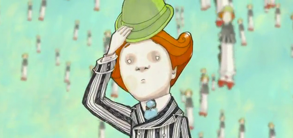
When the Will Eisner Comic Industry Award nominations were released several weeks ago, one title jumped out more than any other. Nominated in five categories, Return of the Dapper Men caught everyone’s eye. For those wondering, here are the categories which it, as well as writer Jim McCann and artist Janet Lee, were nominated in: • Best Publication for Teens • Best Graphic Album—New • Best Writer • Best Painter/Multimedia Artist (interior art) • Best Publication Design Press release: Part fairy tale, part steampunk, all original- the graphic novel that’s already being hailed as “ground-breaking” and “an instant contemporary classic,” RETURN OF THE DAPPER MEN” is published by Archaia and is available wherever books are sold. Features a Foreword by Tim Gunn (Project Runway), and is listed on Publisher’s Weekly Great Graphic Novels as Gifts and “Essential Reading” for Fall 2010 by GraphicNovelReporter.com. Order now from your favorite online retailer or local seller. Imagine a land where Time itself has ceased to exist. Welcome to Anorev, a world in between time, where children have played so long it’s almost become work, machines have worked so long they have begun to play and all the clocks have stopped at the same time. It’s a stagnate land of no change and deep division where only one human boy- Ayden, the boy who still questions, and one robot girl- Zoe, the robot whom all others protect and believe to be special, are the only ones who interact. All of this changes, however, when 314 identical looking dapper men rain down from the sky, bringing time back with them. There is one among these Dapper Men who finds Ayden and Zoe and together the three of them set about changing the world. They must discover what made time stop, understand what their true places are in this world, and learn what “tomorrow” really means. The sun is setting for the first time in memory, and once that happens, everything changes. RETURN OF THE DAPPER MEN is a visually stunning fairy tale that combines steampunk with fantasy and science fiction with Renaissance style, brought to life from the minds of award-winning playwright and comic book writer Jim McCann (HAWKEYE & MOCKINGBIRD) and critically acclaimed visual artist Janet Lee. Together these two have created a world where J.M. Barrie, Lewis Carroll and Maurice Sendak meet Jim Henson and Tim Burton. All sharply dressed in a pin-stripe suit and a dapper bowler hat. Tick tock, time is about to start. I read up a little on the title, and was interested enough to order the book immediately. It took several agonizing weeks to arrive (as I’d bundled it with Chew: The Omnivore Edition Volume 1). My local comic book shop didn’t have any copies (of either), so I was buying the book without having actually gotten to hold it in my hands. I didn’t know what to expect, however the price on Amazon was superbly cheap, so I wasn’t worried. That said, once the package arrived, I was blown away. I could not believe how unbelievably gorgeous Return of the Dapper Men is. Without even cracking open a cover, I knew I was in for a treat. As such, I got myself a nice glass of wine, sat down and put my feet up in my comforter and prepared for a wonderful experience. What I did not expect, despite Tim Gunn’s introduction, was an experience so profoundly moving. Drawing on fantastical stories like Alice in Wonderland, The Wizard of Oz and Peter Pan, Return of the Dapper Men is a story that has the power to change you… so long as you allow it. I’m not speaking of permanent, life-altering changes… but rather just a few moments, upon closing the book and running your hand over the cover, where you allow the child within to see the world for you. Return of the Dapper Men takes place in the make-believe world of Anorev. In this world, time has stopped. As such, there are no nights, no dreams, no tomorrows. Children never age. None but one questions this; a boy by the name of Ayden. Eventually, the children tunnel underground and create a space therein to live. There are no adults (or parents) in this story, though there are robots; and though it is never expressly stated, the metaphor is quite obvious without being one which hits you upside the head. Children and robots do not mingle, but for young Ayden and a feminine robot named Zoe, whom many believe has a purpose which far exceeds all other robots. The story till this point is brilliantly written. You find yourself completely immersed in this world, thanks to lyrically beautiful writing, and artwork that is warm and absolutely gorgeous in every regard. Before we go on, allow me to say that I am the type of reader which writers love writing for. I say this as both a reader and a writer. I allow myself to get sucked into a book. I don’t try to predict the outcome. I simply enjoy the path upon which the story will lead me. I stop and look around. I sometimes get lost. I suspend disbelief and it takes a lot before I try to impart any expectations. Certainly, there are times when I will read with a critical mind, however those are typically instances where that is required and I go in with that mind-set. However when I’m only interested in being entertained, I will open myself to many possibilities, and simply soak up everything on the page. I tell you this because Return of the Dapper Men was able to completely steal me from our mundane world. In so few pages, I was drawn down the rabbit hole and allowed to live in this make believe world. It made sense to me. It breathed and lived and when those hundreds of Dapper Men floated from the sky, all wearing identical dapper suits, my jaw loosened causing my mouth to open slightly. It did not drop entirely, but just this, for a comic book or graphic novel, is an astounding achievement. To have drawn me in so much that I could not put the book aside. I had to know what would happen next. It mattered to me. I was invested. Jim McCann is a brilliant writer whose words flow so effortlessly upon the page. In analyzing the story and the manner in which it is presented, you can appreciate the work that must have gone into choosing each word so perfectly. And yet when reading, simply for the sake of losing oneself in another world, the writing feels organic, and not the least bit forced. It breathes and lives. Allow me to tell you that this is such a difficult state to attain when crafting a story. McCann pulls it off… and what’s more, makes it appear effortless. And then there’s Janet Lee’s art. I was very happy that a brief piece was written at the back of the book which described the process which Janet used to create the illustrations for the book. I was already blown away, but to hear about the process simply made me appreciate the art, as well as the incredible amount of work that went into it, even more. Lee’s combination of decoupage, markers and pine boards creates stunning illustrations that not only fit the story perfectly, but also set the experience aside from all other comic books. Couple that with the book’s design, and you’ve got something that shines above all others on your shelf. As I said on Episode 23 of our podcast, I will be quite disappointed if this book and its creators aren’t awarded for this insanely good experience. There are so few graphic novels with the quiet power of Return of the Dapper Men… nor the intelligence, enlightened writing, or visual impact. Thank you Jim and Janet, for taking us upon this journey. Return of the Dapper Men Archaia Story: Jim McCann Art: Janet Lee...

Locke & Key: Keys to the Kingdom: “Sparrow”

Locke & Key: Keys to the Kingdom: “Sparrow”

Nominated for Best Single Issue (Or One-Shot), Locke & Key: Keys to the Kingdom: “Sparrow” focuses on young Bode Locke. The issue is written by Joe Hill. Art is handled by Gabriel Rodriguez, with colors by Jay Fotos. The issue starts with a single page meant to help folks new to the series get caught up. Basically, the Lockes have lost their father. Their ranks have been infiltrated by someone who’ll stop at nothing to get the key to the Black Door. And there are other keys, and each has the power to save them. In this issue, Bode discovers one such key frozen in the birdbath outside the mansion. Upon walking, or rather crawling through the door which the key unlocks, Bode is transformed into a sparrow (hence the issue’s title). The issue’s lesson, which is delivered to you with the strength of a hardcover novel upside the head, lies in Bode learning the importance of friendship. You see Bode at the start of the issue having problems relating to kids his age. He talks about how he prefers his life of solitude and non-conformity. Upon being transformed into a sparrow, he is whisked up into a flock. He learns that no single sparrow acts as leader, but rather that they all work and think as one unit; a feathered Borg, if you will. Moments after Bode passes through the door, Zack, the “wolf in sheep’s clothing”, passes through after him. Naturally, he takes on the form of a feral wolf. After a gruesome display of power, wherein he and several dogs attack a deer, the pack moves on to Bode’s brother and sister who are walking nearby in the woods. Bode sees this, and together with his flock, swoops down and attacks the pack. They save the two, however in so doing, lose many of the flock. Bode returns to the door, is transformed back to his human form, and goes running to the field where the battle took place. He finds all of the dead sparrows on the ground, tears coursing from his eyes. The last page of the issue shows him interacting with the kids his age, though this time, he makes new friends. This issue is quite literally one cliché after another. It’s well written, within reason, however there is nothing original in the story. The issue is still interesting, and part of me can understand why it was nominated for Best Single Issue (or One-Shot), however I was not that impressed that I would give it my vote as best. In fact, I probably would not have nominated it. As for Rodriguez’s art, it’s quite good. That said, I did not find it consistent, in terms of style. At times, it has a Calvin & Hobbes feel, while on the very next page, it is more realistic. This lack of consistency is especially noticeable when the flock of sparrows attack the feral pack. While some of the panels are drawn quite seriously, others have sparrows with green fighter pilot helmets. Facial expressions are also sometimes off, which off-sets the mood. Between the issue’s blatant lesson, which would make an after school special seem subtle, and the on-again off-again art, I would have found this issue quite difficult to nominate for an Eisner. Apparently the judges disagree with me. That said, I hope they’ll agree that it sure as hell does not deserve to win. Locke & Key: Keys to the Kingdom: “Sparrow” IDW Story: Joe Hill Art: Gabriel Rodriguez, Jay Fotos...

Page 1 of 6123»