Journey into Mystery Issue 622

Journey into Mystery Issue 622

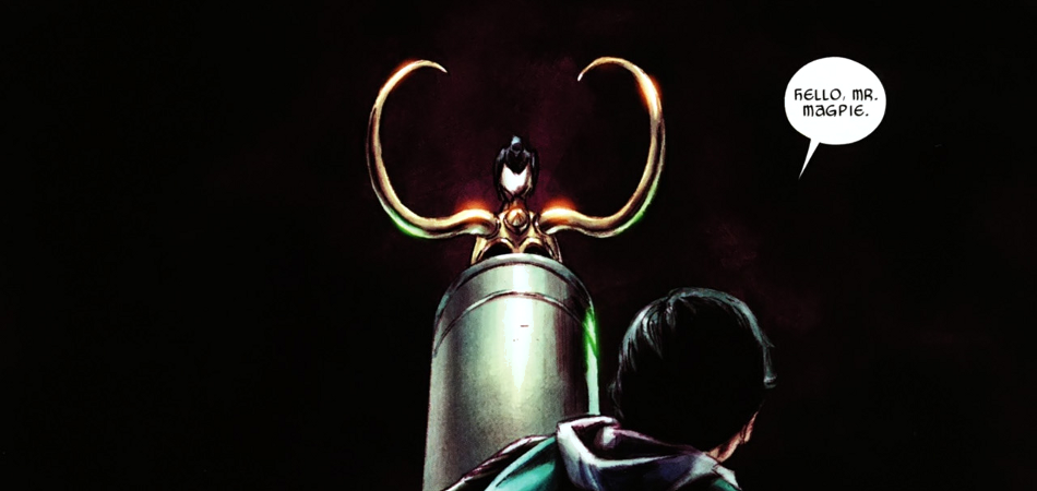
Anybody who listened to our first podcast back after hiatus knows that I’m a longtime fan of Thor and that my co-host most definitely is not. It’s not unusual for two people to wildly disagree on something, but there is an important distinction to be made. There’s a difference between “bad” and “not into it.” When something truly and irredeemably BAD comes across like Superboy or “One Moment in Time,” there’s simply no defending it. However, comics like Thor will only appeal to a limited audience; Journey into Mystery is one of those comics. Journey into Mystery originated in 1952 as an anthology series. Issue 83 in 1962 marked the first appearance of Marvel’s Thor, with the God of Thunder becoming an increased presence, eventually taking over with the comic officially renamed Thor with Issue 126 in 1966. Except for a brief change back in the 90s as part of the “Heroes Reborn” crossover, this month marks the first official return to the original title, paving the way for a relaunch with The Mighty Thor in May. When Thor was at its height of popularity on the 60s, and later in the 80s, the comic offered an interesting mixture of classic Norse myth with sci-fi elements. It was an interesting combination leading to larger-than-life stories. When Thor relaunched in 2007 under J. Michael Straczynski, it came back with a fantasy style, deeply rooted in the myths. When many newer fans think of Thor, this is the idea they get; he’s a god and a king, but not much of a superhero. As a longtime fan of not only the character, but the mythology behind it, I could appreciate the stories, if not the interpretation of the character. When JMS left the title after Issue 603, Kieron Gillen took over for the next 11 issues. While his stories were still in the same theme of Straczynski’s, his characters felt different, more real. With Journey into Mystery focusing on the other Asgardians, leaving Thor available for superheroing in his new title, I was excited to see Gillen return as writer. His handle on the characters, as well as the creativity shown in his stories made him the perfect writer for this series, in my opinion. At least initially, Journey into Mystery is focusing on Loki, Thor’s adopted brother. While largely responsible for the destruction of Asgard during Siege, Loki also sacrificed himself in an attempt to save it. Resurrected in the body of a child by Thor, the new, younger Loki is curious to resolve this paradox presented by his previous actions. While he has many of his old memories, they are incomplete, sending him on his own “journey into mystery.” The opening sequence, following seven magpies, servants of Loki, across the nine realms as they witness the events leading from the fall of Asgard to current day, was a great start. It reads very poetically and sets the tone for the story to follow; this isn’t a superhero comic book. What follows is some fun character building with Loki, the Prince of Lies, dealing with members of an online message board. They’re convinced his pictures of Asgard are fake, and even call him a troll. “But you’re a half-giant,” Thor responds. Yes, it’s a silly joke, but it shows Gillen has no intention of setting the story solely in the realm of the gods; there will still be interaction with the human world and you can blend magic with science. Gillen goes on to establish Loki’s status amongst the other gods, and it’s not favorable. In his previous life, he caused unending trouble, leading to the destruction of their home and will not be easily forgiven just because Thor demands it. This life as an outcast motivates Loki to investigate his past actions, leading to the aforementioned “journey into mystery.” Loki’s quest is detailed in the same style of the opening narration and really establishes Journey into Mystery as a fantasy story of our “hero” on a quest. The art is color over pencils, with no inking. It gives the comic a softer feel with rough edges, making it different from most other comics. It’s a great effect, with subtle shading and radiant glows. While not as refined as the art we’ll likely see in The Mighty Thor, it fits the story perfectly. Again, Journey into Mystery is not a comic for everyone. It’s rooted in the lore of Norse mythology and reads more like fantasy than a traditional comic. However, if that is something you’re interested in, then Journey is a solid read. It has a serious story at its core, but with Loki as the main character, it’s not going to take itself too seriously. The issue also has a backup feature recounting events from the 2007 relaunch of Thor through Issue 621, allowing new readers a chance to catch up. Journey into Mystery Issue 622 Marvel Comics Story: Kieron Gillen Art: Dougie Braithwaite, Ulises Arreola...

Marineman Issue 1

Marineman Issue 1

Ian Churchill’s “Marineman” started very recently. As of this writing, it is only up to issue 4, however during that brief time, it has managed to impress a lot of folks, including the judges who decided to give the series a nomination for a Will Eisner Comic Industry Award in the Best New Series category. Last year’s winner in the same category was “Chew“, also published by Image Comics. “Marineman” has some very large shoes to fill if it intends to win. Some people may recognize Churchill’s work from The Avengers, Uncanny X-Men, Superman, The Coven, Deadpool, Supergirl, Hulk or Elephantmen. The man is an insanely talented illustrator. What some may not realize is that he is also a very good writer. Thanks to the new creator-owned craze, we are getting to see just that in “Marineman“, a comic that has been in the making for quite a few years. Issue 1 begins with a suspenseful prologue that sets the audience up for what to expect. Basically, reading between the panels, you are told that something exciting (and dangerous) lurks below the surface. Once the prologue is done, you are introduced to Steve ‘Marineman’ Ocean. And what an introduction that is… Churchill’s art style is perfectly suited to this series. I read this issue full-screen on my 27” iMac and with every turn of the page, I was amazed at the artwork. The colors are bright, lively, and the shadows perfectly suited to every scene; whether out in the sun, underwarter, or in the gallery of the aquarium. Steve Ocean is, as his father late describes him, a walking tree. Churchill’s over-the-top style works well with Steve, who is mass of muscles complete with wavy blond hair and a permanent, winning smile. Steve hosts a marine show entitled, ‘Ocean Encounters’. He travels the world and brings his knowledge of marine life to the masses by means of his television show. This first issue contains a lot of character and plot setups. We are introduced to his business partner, Jake, who is Steve’s underwater cameraman and good friend. We also get to meet Steve’s father, however not before you discover that there will be a lot more beneath the surface of this series than you’d first expected. Deep below the Marine Research building is a vast cavern which originally belonged to the famed pirate; Captain ‘Flintlock’ Farrell. A hundred or so years later, the US Navy seized it and converted it into a hidden base which they call; Marine Base Alpha. Here, Steve’s father has been working on an mini-submarine prototype that can be used for deep-sea exploration. The issue’s last panel introduces yet another key character, Lieutenant Charlotte Greene, a highly recommended pilot who will test the sub. “Marineman” issue 1 is exceptionally well written. Without resorting to superhero hijinks, Churchill creates an intelligent, yet suspenseful first issue that sucks you in. Some may be a little put off by the mass of dialogue, especially in terms of marine facts, however I found it quite informative and felt it helped forward the story. I am quite disappointed that Ian Churchill was not also nominated for Best Writer/Artist. There may be a reason for that which I’m not aware of, however looking at the current list of nominees in that category, Churchill would definitely be a contender. That said, having read the next three issues in this series, I can say with certainty that I am very glad it has been nominated for Best New Series, and I wish it good luck. Expect more individual issue reviews soon, as I have been loving every single one. Ian Churchill’s “Marineman” Image Comics Story: Ian Churchill Art: Ian Churchill, Nicolas Chapuis...

Fables Issue 100

Fables Issue 100

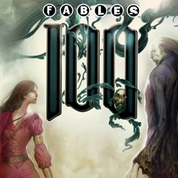
Nominated for a Will Eisner Comic Industry Award in the Best Single Issue (or One-Shot) category, “Fables” issue 100 was the first title I read that I simply did not feel belonged on the list of nominees. I will readily admit to not having read any prior issues, however I do not believe that had any impact on my decision. Based on the fact that the series contains existing (well-known) characters, as well as the fact that it was nominated as a single issue, I feel that a sound opinion can be made having only just read this issue. “Fables” issue 100 contains several short pieces, as well as a puppet theater. Yes, you read that correctly. Here is a complete list of the contents: • Single Combat • Pinocchio’s Army • The Fables Paper Puppet Theatre • The Perils of Thumbelina • Celebrity Burning Questions • A Thing With Those Mice • Escape to Wolf Manor The issue begins with a lovely image of Three Blind Mice discussing the definition of the word “duel”, setting up the first, and main, story. The mice break the fourth barrier in this single panel, by making reference to the “issue” that they are in. “Single Combat” is written by Bill Willingham, pencilled by Mark Buckingham, inked by Steve Leialoha and Andrew Pepoy and finally colored by Lee Loughridge. One would think that with so many people working on it, I would be more impressed. However, I am not. I’ll get to the story shortly, however in terms of the art, I must admit to being completely underwhelmed. Perhaps it was their intent to recreate a style reminiscent of old fable comics from decades ago, however I wasn’t a fan of that style then, and that opinion has not changed. The story contains several concurrent plot-lines, and though they converge at points, I still found the manner in which they were handled somewhat clumsy. The main part of the short story of course is the battle between the witch, Frau Totenkinder, and Mister Dark. Having once been contained within a box in issues prior, Mister Dark was unwittingly set free. Totenkinder intends to contain him again. The battle between the two is full of conjurations, be they shadows, boxes or fish (yes… fish), shapeshifting, and the likes. If you were reading this to a child, perhaps they would be entertained by Mister Dark being force fed sugar in such large amounts that it causes his teeth to fall out, however an adult may be far less interested. In the end, Totenkinder transmutes thousands of gold pieces into an armor meant to contain Mister Dark. Seeing as he is allergic to gold, it seems the smartest type of box to use. Would that this had been the true focus of the story, perhaps it would not have felt so disjointed. However during this fight, we have pages which flash to Fabletown, where the fight is being announced and discussed; we see “real” police in New York City preparing to take action if the fight spills outside of the old Fabletown area; and we’ve the sheriff’s wife who is having labor complications… not to mention the altercations with Nurse Spratt. Even when you think it’s all done, cracks begin to appear and Fabletown is turned on its head once more. Sadly, I just did not enjoy this story at all. Having spent countless hours reading fables to my children, I can honestly say that I’ve no prejudice against this type of story. However, they must be properly told, and in this case, I simply do not feel they were. Next we have the short story, “Pinocchio’s Army” which spans eight pages. It is written by Mark Buckingham with several illustrations by Bill Willingham. With lines like; “(Pinocchio) hew that Internet porn and an expresso machine were things he would have to live without for now”, you are not likely to read this story to your children any time soon. The story sees Geppetto’s creations (children) worried about the old man. He has grown quite sullen, and it is up to Pinocchio to cheer him up, which he does by presenting him with a suitcase full of toy soldiers, which Geppetto had once crafted years before. Once again, I’ve a problem with the writing in this short story. This may simply be a personal preference, however I found it far too descriptive. When you are limited by a restrictive word count, you don’t want to waste paragraphs setting the stage, when instead you can be furthering the story. Also, I found Buckingham’s pace extremely slow at times. For a story this short, I should have been able to easily read it through in one sitting, however I found myself “zoning” out often, and it took several readings for me to actually finish it. After this short story, we find the Puppet Theatre, where readers are encouraged to cut shapes out of the comic book. /gasp Seriously. I would not even advise a child to do this. I know what they are trying to do here, but dear lord… cutting into a comic book?!? “The Perils of Thumbelina“, written by Bill Willingham, with art by Chrissie Zullo, is a complete and utter waste of three pages. The vignette shows a boy trying to ask Thumbelina out on a date, only to have a hawk (or falcon) drop from the sky and grasp her in its talons. As she is being whisked away, she says; “Well… this is certainly turning out to be a lovely day”. No. Really. I’m not making this up. As disappointing as that was, it paled in comparison to the illustrated answers to reader questions, such as; Who makes the Fabletown comic books; Can I have Snow White’s phone number, and; Now that Baba Yaga is dead, how is Bufkin passing the time? The only story which I found mildly amusing was the last one; “A Thing With Those Mice“, also written by Bill Willingham, with art by Joao Ruas. As a point of interest, Ruas’ art is absolutely stunning, as opposed to most of the art in this issue. The vignette is quite simple, which is hardly a surprise. It depicts the Three Blind Mice who are on their way to see the King, in order to receive their knighthoods… among other things. They, of course, get lost and proceed to walk into the open mouth of a beast… whom you find out will in fact spit them out once he’s had a bit of “fun with them”. There’s really not much else to say. The issue ends with a board game entitled; Escape to Wolf Manor… yet another example of the writers misunderstanding the medium. Comic books are meant to be read, not cut apart and played upon. Some argue that this issue is meant for children, who are more likely to want to decimate their comic books for the sake of a few quaint moments with a puppet theatre. However to those I would argue, if this issue truly were meant for children, there would be no mention of pornography by Pinocchio, nor bestiality by Lily Martagon in the reader questions. I just don’t understand why this issue was nominated for an Eisner. In and of itself, it is not a good issue. I don’t feel it is deserving of a high review score, let alone an Eisner nomination. When compared to “The Cape“, I fail to see what was going through the judges’ minds when they agreed to give “Fables” issue 100 a nomination. I only hope it does not win, as that would be an insult to all the other nominees. “Fables” Issue 100 Vertigo/DC Stories: Bill Willingham, Mark Buckingham Art: Bill Willingham, Mark Buckingham, Dan Green, Lee Loughridge, Joao Ruas and others...

I Am An Avenger – Post Mortem Short

I Am An Avenger – Post Mortem Short

Nominated for a Will Eisner Comic Industry Award in the Best Short Story category, “Post Mortem“, found in “I Am An Avenger” issue 2, is a powerful story about how Steve Rogers copes with the loss of soldiers under his command. The story was written by Greg Rucka, with the script being written by Michael Lark and Stefano Gaudiano. The rest of the issue is a complete waste of paper in my opinion… especially the pie eating short story. However “Post Mortem” is a very powerful story and I am glad it got singled out. “Post Mortem” is very light on dialogue and narrative. There are pages without so much as a spoken word, however in each panel, more is conveyed than any word ever could. There are emotions and situations which are better understood using art as a medium. Michael Lark’s art for this short manages to get across every hint of emotion, however his style is very reminiscent of old 80s and 90s comics. I’d have liked to have seen something far more intricate for a story of this caliber. This is not meant to insult Lark’s work, as it’s still quite good. However I believe the story warrants far more than he was able to produce. “Post Mortem” begins with Steve Rogers being informed that there was only one casualty from their last operation. Rogers gets the information regarding the whereabouts of the soldier’s service, and attends to pay his respect. During the scenes in the church and at the cemetery, Rogers must endure hateful glares from the soldier’s wife. He approaches her after the burial service, and asks her to tell him about Donny (the fallen soldier). He also says he would like to ask a favor or her, though the reader doesn’t get to know what that favor is until the last few panels of the short story. On the last page, we see Rogers unpacking from his trip, having returned home. He then stares at a single dog-tag, and then tosses it into a box full of tags worn by other fallen soldiers. In this powerful moment, we get to see that Rogers isn’t some heartless commander who sees his men only as pawns. Rather, he remembers every single soldier lost under his command. I really liked this short story a lot. There’s an artform to writing powerful short stories. You have so little space to work with, and must be able to convey so much in those few pages. Rucka, Lark and Gaudiano managed to pull that off with grace here. I’ve not yet read the other nominees for Best Short Story, however I can clearly see why this short was nominated. “Post Mortem” I Am An Avenger Issue 2 Marvel Story: Greg Rucka Script: Michael Lark and Stefano Gaudiano Art: Matt Hollingsworth, Travis Lanham...

Superboy Issues 1-5

Superboy Issues 1-5

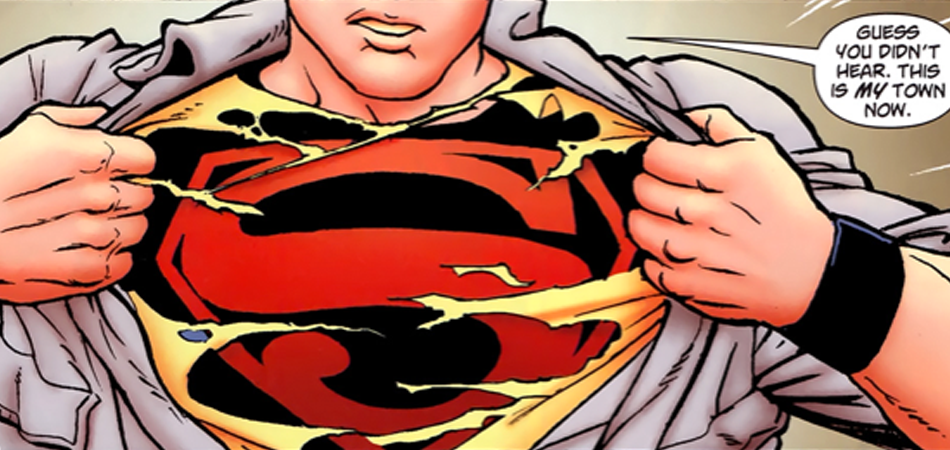
When I’d read that this year’s Will Eisner Comic Industry Awards nominations contained a lot fewer superhero titles, I expected that the few that had made the cut would really shine out as stellar examples of the genre in the past year. Taking that into consideration, I was quite surprised to see “Superboy” listed for Best New Series. “Superboy“? Seriously? I’d read the first issue, and having been somewhat underwhelmed, had not bothered keeping up with the series. Seeing as it was given a nomination, I figured I’d catch up with Connor Kent and see what he’s been up to. Turns out, he’s been having to deal with a lot… though nothing out of the ordinary for a DC superhero. So why the nomination… Allow me to shed some light on what has transpired in the first five issues, and from there, you may come to your own conclusions. However before we start, just so folks don’t think me overly harsh due to some pre-conceived opinion of the character, allow me to say that I’m a huge fan of the Teen Titans. We’ve also been watching Young Justice on TV, and I loved the introduction of Superboy in the series. I think the character has been very well handled in Young Justice, making him one of the more interesting ones to see develop. I can’t say the same for this comic book series, however. Issue 1 starts with a narrative from Connor wherein he states how he wishes he could have had a childhood. Writer Jeff Lemire and artist Pier Gallo go with a cliched image of a boy, garbed in a superhero outfit, running through a field of wheat in Smallville. I do like that Lemire didn’t allow Connor to wallow in self-pity, but rather is forcing the character to mature quickly, accept his creation, while still granting him a wide berth for self-discovery. Almost immediately, Superboy is visited by Phantom Stranger who informs him that great peril is coming to Smallville, and that Superboy should prepare. Despite the fact that Superboy makes light of the “ominous, cryptic shtick”, it’s still a lame setup. Being told that danger’s afoot isn’t really all that suspenseful. Trouble does in fact arrive, in the form of the Parasite… though not before we’re forced to endure several painful panels of Connor Kent interacting with Lori Luthor (Lex’s niece) and Simon Valentine, who has discovered that Connor is in fact Superboy. This revelation should have been quite shocking, however the manner in which it was presented instead made it feel as though it was just an unimportant plot-point to be skimmed over immediately before the Parasite’s surprise attack. That said, apparently Connor needs some tips on keeping his secret identity, well, a secret. Ripping off your shirt in a barber shop full of people, revealing your Superboy black T-shirt, will not help you toward that goal. Overall, Issue 1 feels rushed. Although I will admit that the Parasite fight was well choreographed… still I would be remiss if I did not point out how disgusted Vince was with the fact that the Parasite was defeated by wheat. If the same attention to detail could have been used with the rest of the script, we’d have had a great comic. Though even then, I would not have given it an Eisner nomination. So let’s move on to Issue 2. Poison Ivy made an appearance at the very end of Issue 1, and I was very curious to see how this would pan out. I love when villains travel to new cities, and seeing Poison Ivy out of Gotham seemed like it may be fun. Before we go further however, allow me to shake my head, ever so slowly, toward Pier Gallo, for catering to the lowest common denominator when drawing Poison Ivy.              Congratulations. Those anatomy classes paid off. You know how to draw an ass. This is something which I’ve discussed at length in a feature for my personal site (and I may yet import that feature into this site to stir up some comments). I’m tired of these costume designs and virtual camera angles that are meant only to titillate. Honestly, grow up. We have. Luckily this is not the norm in “Superboy“, otherwise I’d have given up on the series entirely and chalked it up as a young, pubescent boy’s series. As for Gallo’s style as a whole, I know I haven’t discussed it yet, but that’s because I’m torn. There are panels which blow me away… followed by, well let’s be honest, tripe. Overall, I’m not a fan of the style, however I can appreciate the man’s talent. Getting back to the story, the Poison Ivy content was brief, and quite obviously, predictable. Though she pretended to want to ally herself with Superboy for a greater good, she of course turned at the end… only to then be defeated by parasitic frogs. Seriously. Apparently, this shit can be made up. This issue served to add more suspense to the ongoing mystery. The entire reason for Poison Ivy’s visit is explained in the final page of Issue 2, and you’re left to wonder how everything is going to tie in together. This issue also further defines the working relationship between Superboy and Simon. It becomes quite obvious that the two are going to be working together more closely, though it’s difficult to tell whether it will be as an equally ranked duo, or as lead and apprentice. And lastly, the issue lays the groundwork for Smallville… so to speak. The recent battles have ripped the crops apart and Superboy feels it is his responsibility to see to it that the farmers do not suffer needlessly because of it. Still with me? A’ight then, let’s flip through the third issue and see what awaits us. If you were expecting a rational splash page for the third issue, you will be seriously disappointed, as you may be with the entire issue. It seems there’s a force at work that is causing everyone but Lori Luthor to pass out; or in Connor’s case, struggle with consciousness, staggering around to find the source of the psychic assault. It’s during these first few pages that Lori discovers that Connor is Superboy. He decides to remove his plaid button-down in the hall, revealing his black Superboy T-shirt and she hides from him upon seeing this. Again… seriously Connor… secret identity. Hell, at least Superman found a phone booth. We’re three issues in, and already two of your classmates have discovered your identity. But I digress. Issue 3 was entirely character driven. We see Connor giving Bart (Kid Flash) a call to setup a fundraiser race to raise money for the local farmers. We also see Connor telling Simon Valentine that their friendship must come to an end if their superhero partnership is to continue. Apparently Connor’s worried about folks figuring him out if they see Simon with both Connor and Superboy. But ripping off his shirt in public, that’s cool. /sigh This issue also introduced us to the time travelling physic (responsible for the initial collapse of the schools population); Sajan Mehra, codename Psionic Lad. You’d think that by 2216, they’d have given up on calling teenage boys “lad”, but apparently they’re stuck with that stupidity for hundreds of years to come. I’d like to say I’m interested in Psyionic Lad, or the Hunting Party which followed him to Superboy’s time, however I simply am not. There is nothing original here. We’ve seen these tired scenes time and time again over the ages (pun intended). Issue 4 starts with Psionic Lad and Superboy tackling the Hunting Party, only for them to leave “mysteriously” when Simon happens upon the fight. Apparently a CODE-1 is pretty heavy. From that point on, the rest of the issue is entirely character and story driven. There is not one panel of action. We get more information about Psionic Lad, only to find out later that it’s quite likely all a lie (sorry, uh, spoiler?). We also get some melo-drama between Connor and Lori. I understand that in a series that revolves around a teenager, you will get drama. That is to be expected, and in the hands of a sufficiently talented writer, it can still be engaging for an adult. However there’s a fine line between drama and melo-drama… and you have to be very careful how you dance upon that line. Too much melo-drama will make the adults who are reading simply sigh and roll their eyes. This issue also cemented my opinion of Gallo’s panel pacing, and the verdict is not good. I simply do not like how he arranges his panels. In some instances, it’s painful and destroys the story’s pace.              You only realize how important this is when you see it done so poorly. Although that said, having read Issue 6 with art by Marco Rudy, I can see that this will be a problem which plagues “Superboy” for some time yet to come. The panel placement in Issue 6 was absolutely terrible… however we’ll leave that for a separate review, as we’re only covering issues 1-5 in this feature. Let’s just skip to Issue 5, which actually was my favorite. This issue sees Superboy racing Kid Flash around the globe in an effort to raise money for the farmers whose crops were devastated by Poison Ivy. The question though is haven’t we seen this all before?                                  Now, some may argue that “Superboy” is paying homage to the original “Superman vs The Flash” issues… but to them I would argue; enough is enough. There comes a point where you are no longer paying homage, but rather being a lazy writer. Ironically though, and I hate to say it, this was still my favorite issue of the five. I enjoyed the camaraderie between Connor and Bart. I enjoyed their stupid race, and I chuckled at the outcome. Still, I wish Lemire could have been more original. In addition to the race, we also got some brief relationship moments between Superboy and the Teen Titans. Not much else occurs in this issue. Lori jumps the shark in terms of potentially finding an excuse for shifting toward the “dark side”. Her emotions seem completely unreasonable, though Lemire may be relying on teenage drama as a justification… or the “mysterious” alien artifact upon which she’s been dropping her cigarette ashes during her midnight smoke-breaks away from her catatonic mother. We’ll have to see in future issues. Or rather, you’ll have to see in future issues. I feel I’ve given this series a very fair chance, and taking everything into consideration, I’ve little but disappointment when thinking of where it’s been and where it appears to be going. Not only did they not “hook” me from the beginning, but they didn’t hold me when I forced myself to read more than I otherwise would have. Also, I routinely felt as though I was being force-fed regurgitated, cliched scripts… and I don’t have the time for that. If I’ve already read the same concept several times over the years, I’m not likely to want to sit through it yet again… and I certain don’t want to lay down any bills to add further issues to my collection. Honestly, I don’t know why this series was selected as a nominee in the Best New Series category for the Will Eisner Comic Industry Awards. I can think of many others, in the superhero genre, which have pushed the boundaries of what we have grown accustomed to. I strongly disagree with this nomination, and as a rating for the series as a whole, so far, the most I could give would be a 6/10. Perhaps a 6.5. I did not see any spark of potential, to tell you the truth. i imagined some, but that was from my own ideas of where the series should go…. not because of anything the writer created or suggested. Superboy (Issues 1-5) DC Comics Story: Jeff Lemire Art: Pier Gallo, Jamie Grant...
Joe the Barbarian

Joe the Barbarian

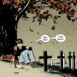
As with “The Cape“, I hadn’t heard of “Joe the Barbarian” until the list of nominees was released for the Will Eisner Comic Industry Awards that will be awarded at Comic-Con 2011. And just as with “The Cape”, I certainly am glad to have read this amazing title. You may be thinking that I’m being far too agreeable with the Eisner list of nominees, and I can assure you, that is not the case. Expect forth-coming, harsh reviews of titles which I feel have absolutely no business there. That said though, when I read something listed which so thoroughly impresses me as “Joe the Barbarian” has, expect that I’ll lavish all manner of compliments on the writer and artist responsible; Grant Morrison and Sean Murphy, respectively. At its heart (which it has an abundance of), “Joe the Barbarian” is the simple story of a diabetic boy who is going into shock. He must get from his bedroom in the attic of his home, to the kitchen on the main floor to get some form of sugar (he mentions having to get a soda often). During this tenuous journey, he experiences hallucinations. In Morrison’s adept writing hands, this simple premise turns into an epic 8-part mini-series which sees Joe joining imaginary beings in a life or death struggle. The story begins very slowly. Some people had a problem with the first issue, however I thought the pacing was actually spot on. We get to see Joe’s relationship with his mother, find out about the death of his father and the family’s financial troubles. We see the resentment which Joe holds toward his father, as well as see how this has affected his character and his ability to interact with other kids his age. All of this is done quite well, and you are able to read volumes between the lines. Morrison’s writing impressed the hell out of me in those early pages, as this is something which I work at in my fiction; the ability to impart so much more than the few words used. Then, Murphy took over, and completely blew my mind. Having seen that Joe is a very reclusive boy, showing his home in detail and his relationship to it was absolutely vital to the story… and Murphy handles this beautifully with silent panels of Joe walking through the home to his bedroom in the attic. These pages are draw in such intricate detail that the reader is able to recognize a variety of the objects in each room. This is so absolutely important, seeing as the house is also the setting for Joe’s hallucinations, though it is warped and skewed and misrepresented by fantastical settings. Some of the details change during the hallucinations, however not enough that you are ever lost. Morrison also makes certain to keep you from getting lost, by jerking Joe back and forth between his actual struggles and his lucid hallucinations. However the two are never entirely separated. Within his hallucinations, Joe keeps imparting how important it is that he get to the kitchen to get a soda. He is able to sometimes rationalize where he is in relation to where his physical body is in the actual world. Meanwhile within reality, Joe speaks to his pet rat, Jack, who plays a very important role in the story. Having lost his father, Jack is a life which Joe clings to. As you can see from this image, Murphy does not hold back on his 2-page spreads… and there are a great many of them in the 8-issue series, each as glorious as the next. Dave Stewart also deserves a lot of credit for his incredible coloring job. He seems to capture the mood of each issue… each panel so perfectly. Whether Joe is in his home, the colors fading over each issue with the passing of daylight (an integral part of the hallucinations, by the way), or he is in an underground sewer where the dwarves live, Stewart’s coloring of Murphy’s art always manages to impart upon you a sense of how you should be feeling. It’s not overpowering, however it does guide your emotions by means of visual cues. While the first issue was nearly all character and location setups, issues 2-8 are all action. As such, this would be a very difficult series to begin partway through. No mini-series is intended to be read out of order, however some are easier to pick up and try (leading to you to read the entire series if you enjoyed a single issue). That’s not really an option with “Joe the Barbarian”. You need that first issue to make sense of the whirlwind which ensues. Without that, you will most certainly be lost. That said though, I do not hold that against the series or Morrison. That’s like blaming a novelist because a reader has picked up their book, started a third of the way in, and complained because they didn’t understand what was happening. Crafting Insanely Cool Hallucinations As if dealing with so much innocence lost wasn’t enough, Joe is also forced to confront all of his underlying issues in the form of animated toys, a brother-in-arms who just happens to be his pet rat, and more importantly a long-standing prophecy which states he is the “Dying Boy”… complete with mosaic portrait. Despite simply wanting to get a soda so that he doesn’t die, Joe is thrust into a quest to save this fantasy world by defeating King Death. In the real world, the house’s electricity is off, and Joe must head to the basement to flip a breaker switch. Having lived in an old home, I can attest to having had to flip breakers on a regular basis. As the sunlight descends, it brings with it all manner of imaginary nightmares for the inhabitants of Joe’s hallucination to deal with. Some, like her Majesty, Queen Bree, rely on batteries to provide the light which they need, however even within the confines of his imagination, these characters know that the batteries will not last forever. Queen Bree is also known as the High Widow… Joe’s mother. I love how Morrison blended characters from Joe’s life, his imagination and his toys to produce such a vast, diverse cast. Among others, Joe crosses paths with a variety of his action figures, some pissing arms or legs. There is something unbearably hilarious about recognizing some of these, including ol’ Bats himself… whose head pops off during one of the epic battles which occurs later in the series. Nearing the end of the series, Joe is forced to decide whether he wants to leave the hallucination or save those within. He chooses to defeat the darkness first, which leads him to the basement where he comes face to imaginary face with King Death. What ensues is a battle which other comic book creators should look to for inspiration when crafting battle scenes. Jack, who had just recently gone toe-to-toe with an insane, feral dog… … and seriously… take a good look at this screenshot. Murphy and Stewart should win an Eisner based on this alone. Upon entering King Death’s lair, all seven of Jack’s slain brothers are resurrected to fight as King Death’s minions. I won’t spoil any more of the battle, as part of the excitement is reading it firsthand. That said, it is important to note that the true measure of how incredible the resolution is, is in the fact that it transcends both Joe’s hallucinations and his reality. In the end, it is simply a hallucination. He is fighting for his survival in both realms, however the very real soda in his hands is the only true resolution. Morrison understands that, and doesn’t treat his readers like idiots. Still, he finds a way to make what could be a very mundane ending into something which, if you’ve allowed yourself to get sucked into the series, will cause the hair on your arms to rise. You’ll let out a silent cheer for Joe, and feel truly satisfied with the manner in which it was handled. In real world terms, the resolution is actually immensely important to Joe. Joe the Barbarian is nominated in the Best Limited Series category for the Will Eisner Comic Industry Awards. I will be reading several of the other nominees in order to assess which I believe was the strongest this past year. I can say with certainty that I am very glad it was nominated. It is a spectacular series which I am looking forward to seeing turned into a feature film. The rights were picked up last year and I can see how, in the right hands, it could produce an insanely cool movie. In addition to the Best Limited Series nomination for the series, Dave Steward was nominated for Best Coloring for his work on Joe the Barbarian as well as Hellboy, BPRD, Baltimore, Let Me In (Dark Horse); Detective Comics (DC); Neil Young’s Greendale, and Daytripper. Also, Jimmy Gownley was nominated for Best Lettering for his work on several titles, including Joe the Barbarian. I hate giving out arbitrary numbers for review scores, as they mean absolutely nothing, however just as a measure so folks can understand how much I appreciated this series, I would give it a strong 10 out of 10. And as much as I admit it’s an arbitrary number, I would not give it a perfect score unless it deserved it. I am very critical of that which I read and have no problems voicing my opinions. However when praise is deserved, I believe it should be given. Grant, Sean and Dave, thank you gentlemen for entertaining me last night, as I devoured every issue, unable to stop till the very end. And thank you for never disappointing me along that fantastic journey. Joe the Barbarian DC/Vertigo Story: Grant Morrison Art: Sean Murphy, Dave Stewart...

The Cape Issue 1

The Cape Issue 1

The Will Eisner Comic Industry Award nominations were recently announced, and one of the titles that caught my eye in the Best Single Issue (or One-Shot) category was a comic titled “The Cape”. To be quite honest, this title had flown completely under my radar when released last year. That said, I am very glad the Eisner nominations cast a spotlight on it. “The Cape” is a mature title, and rightly so. It contains some harsh language, as well as drug use, however none of it is intended to shock the audience. The story and its characters are honest. “The Cape” starts as a flashback to when the central character, Eric, was a young boy. From the beginning, it’s hard to tell if the comic will be a stark drama or fantastical tale. As it turns out, it’s a bit of both. You find out that Eric’s father had been killed in Vietnam, leaving his mother to raise he and his brother Nicky by herself. The boys would play superhero games, and it was during one such escapade that Eric’s cape caught in a tree branch, causing him to fall quite some distance. From that point on, Eric is a different person. The fall, and its subsequent operations, cause him no relief. He turns inward, and loses all ambition. Whereas his girlfriend, Angie grows, matures and progresses with her life, Eric only sinks deeper into self-pity and anger. His relationship with Angie falls apart, leading back to his mother’s house, this time in a room in the basement. It’s there that he discovers that though his mother had said she’d thrown out the afore-mentioned cape, she had in fact simply stored it in the basement. While he sees this as her being cheap and never throwing anything out, the reader will know that the real reason is no doubt because of the Marine badge sewn on the cape which had once belonged to Eric’s father. By this point in the story, we begin to see a far harsher side to Eric. It’s in his thoughts, as well as his eyes. In this regard, penciler Zach Howard does a phenomenal job. Overall, the art in “The Cape” is quite good. Nothing extraordinary, but good. Its lines are hard, which suits the story. I also liked the old school pointillism style of shading. You may be wondering when the fantastical portion of comic begins, and that is the moment he puts on the cape as an adult and discovers that it grants him the power of flight. Due to the seriousness of the comic up until that point, it is easy to wonder whether or not Eric’s flying escapade is only occurring in his imagination. However you see shortly thereafter that the cape is, in fact, magical. “The Cape” is based on a short story by Joe Hill by the same title. Having read this comic now, I am very interested in finding this short story. I would love to read even more into the tale, as it would definitely lend itself well to further narrative. As a comic, it absolutely excels in every way imaginable. The story is tight, honest and gripping till the very last panel. It works very well as a single issue, however the fact that IDW plans on continuing the story this year makes me quite happy as well. Having not yet read any of the other nominees for Best Single Issue (or One-Shot), I can’t say whether it deserves to win. However I can say with certainty that it did deserve the nomination. The Cape Issue 1 IDW Story: Jason Ciaramella (based on the short story “The Cape” by Joe Hill Art: Zach Howard, Nelson Daniel...

Uncanny X-Men Issue 534.1

Uncanny X-Men Issue 534.1

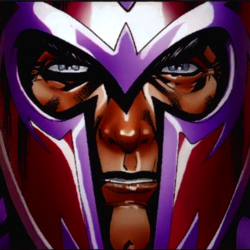
Despite being the flagship title for the franchise, Uncanny X-Men has been a bit inconsistent over the past few years. It’s not that Matt Fraction is a bad writer; I’m a fan of his work on Immortal Iron Fist and Invincible Iron Man. There’s just something about this title that doesn’t quite click with his style of writing. Perhaps it’s the ensemble cast or the position the story was in when he took over, but the whole San Francisco era of the X-Men just hasn’t worked for me so far. There have been some highlights, but there have also been some weak stories. With Issue 531, Kieron Gillen (Generation Hope, Thor) joined Fraction as co-writer for the “Quarantine” storyline. The core story was fun and interesting, but overall the issues were bogged down with having to tie up some of Fraction’s outstanding storylines. Still, there was a noticeable shift in tone once Gillen joined the writing staff. With “Quarantine” done, Fraction has moved off the title to focus on his other work, such as the big Fear Itself miniseries, leaving Gillen as the sole writer for Uncanny. Gillen’s first solo issue is one of Marvel’s “Point One” issues; stand-alone stories taking place in between the normal numbered issues intended to be “jumping on points” for new readers. Overall, the whole initiative has been a bit of a flop. Of the few issues I’ve read, some of them have been quite good, but didn’t satisfy the “jumping on point” criteria. As great as Invincible Iron Man 500.1 was, a new reader would have no idea what’s going on in issue 501. The only total success I’ve seen so far is Hulk 30.1. It was a damn good issue, and set up the direction of the comic for some time to come. Uncanny X-Men 534.1 falls somewhere in the middle. It’s a strong issue and, while it may not set anything up for the next story arc, it establishes a solid idea for how Gillen will be writing the title in the future. The story revolves around the X-Men’s Public Relations specialist, Kate Kildare, and her attempt to make the public feel safe around the mutants when Magneto, a known terrorist, is revealed to be part of the team. I loved it when Fraction brought Magneto to Utopia, especially when he recognized Cyclops as the leader of the mutant race. It was a strong story element, but Magneto has been a bit lost since. Mike Carey is doing great work with him in X-Men Legacy, but I’m glad to see Gillen picking him up for some more development here. The problem with Magneto is he’s still very much the same person he was before. Though his extremist methods and ideology may have shifted some, he still has the same unforgiving personality. Magneto and public relations go together as well as Wolverine and metal detectors. He would much rather be feared than loved, but fear from normal people is the last thing the X-Men need right now. Meanwhile, Cyclops, Wolverine and the team are called away on a mission by the mayor of San Francisco. Crooks posing as AIM scientists have been causing small earthquakes to extort money from local companies wishing to protect their interests. However, it turns out they were merely predicting the earthquakes and San Francisco is due for a major jolt, endangering countless lives. At the last minute, the Master of Magnetism steps in to protect the citizens in a stunning display of power. In one motion, Magneto started down the path of earning the trust of San Francisco’s populace. Slowly, their fear of what he’s capable of will become respect for his power. Nothing will change overnight, but I thought it was a great way to make Magneto more acceptable without compromising his character, something Fraction was never able to do. Art for this issue is fantastic, with Carlos Pacheo filling in on pencils, since Uncanny‘s regular artist can’t draw two issues in one month. The coloring makes the characters seem a bit too “plastic” at times, but Pacheo nails the character designs and action scenes. Unfortunately, that’s also the worst part of this issue. Pacheo’s art is so nice, it’s a stark contrast to regular artist Greg Land’s normal style of tracing and recycling. Still, Uncanny X-Men‘s writing looks to be in good hands with Gillen and he’s got some interesting stories on the way. Uncanny X-Men Issue 534.1 Marvel Comics Story: Kieron Gillen Art: Carlos Pacheo, Cam Smith, Cam D’Armata...

X-23 Issue 8: Collision, Part 1

X-23 Issue 8: Collision, Part 1

If you haven’t been keeping up with X-23, and frankly at this point, I wouldn’t blame you if you weren’t, allow me to fill you in. In the midst of her soul searching journey with Gambit, X-23 has discovered that the former director of Weapon X, Malcolm Colcord, is thinking about restarting the project. I mean, why not? It turned out so well with X-23. This isn’t really news. We saw them creating many more clones at the end of the mini-series, and truth be told, unless you are completely new to Marvel comics, you know that Weapon X is always just beneath the surface of most Wolverine and family series. X-23 wants to track down Colcord, and so she and Gambit head to Madripoor, a cesspool of depravity. Last issue, as a means of gaining passage to the island, we saw the duo infiltrate a pirate base in the hopes of saving a police informant. The issue read very much like a filler. That said, the art was insanely cool. Kudos to Sana Takeda for that absolutely gorgeous issue. The art in issue 8 is also quite good though much more traditional. Back to the story. Laura is tracking her, what… brother… son… ? She believes Daken knows where Colcord is and intends to get the information from him. I’ve been having a difficult time with Marjorie Liu’s writing for X-23. Too often, it feels as though it is being written on the fly. Such a big deal was made about whether or not there would be a meet-up between X-23 and Daken, and finally it occurs in this issue. And I am underwhelmed. The setup to lure Daken to X-23 is weak, transparent and the fact that they made him fall for it only furthers my belief that he is one of the weakest links in the current Marvel line-up. I’ve very little use for the character, having read through all the current issues, and this did nothing to change that opinion. Furthermore, the inevitable fight scene between the two is terribly choreographed. Gambit is nowhere to be seen, the pacing is choppy, and quite frankly, X-23 should be able to slice him like a side order of sushi. She is a trained assassin. From birth, she’s known little else. Daken should not pose this much of a problem for her. However in an attempt to sell more comics and capitalize on the popularity of characters with the term “snikt” in their vocabulary, this fight continues in Daken #8. I was not impressed with this issue of X-23… and somehow I’ve a sense that I’ll feel the same about Daken #8. On a final note, someone should inform cover artist Kalman Andrasofszky that Daken’s claws are not coated in adamantium. X-23 Issue 8: “Collision, Part 1” Marvel Comics Story: Marjorie Liu Art: Ryan Stegman, Michael Babinksi, John Rauch...

The Walking Dead Issue 83

The Walking Dead Issue 83

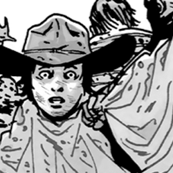
I cannot for the life of me think of a single other comic book series that has gripped me so entirely. Robert Kirkman has created a world where characters introduced a mere five issues prior can become integral to plot points… characters whom you suddenly find yourself caring for very deeply. Issue 83 of The Walking Dead, titled “No Way Out, Part Four“, contains the most dramatic moment in the entire series. This is saying a lot, and anyone who has read all prior 82 issues without having gotten to 83 should take a moment and think about the weight of that statement. Remember the death of Shane and Lori. Picture Rick’s hand coming off. Think of Dale being cannibalized. The list goes on and on. More has happened in 83 issues than has occurred in popular long-running series. However nothing like this. I’d have thought something like this would have been saved for an anniversary issue (say, 100), however nope… there it is for you to stumble upon, and if you’re anything like me, your heart will have skipped a beat at what is now the most gripping single pannel in the entire series. As it is impossible to say much about this issue without spoiling it for others, the remainder of the review will continue below. I strongly urge you not to click the following link unless you have read the issue. In the words of Vince in his vidcast, “You’ve been warned”. The Walking Dead Issue 83 Image Comics Story: Robert Kirkman Art: Charlie Adlard, Cliff Rathburn (Gray Tones, Cover Colors)...

Page 2 of 61234»